
Sunday, September 19, 2010


Friday, September 17, 2010


Sunday, August 15, 2010
School Project - Re-vamping Movie Poster
Re-vamping Movie Poster - Kungfu Panda
Original Poster

Re-vamped Poster

Rationale: Background colours (red and orange) are chosen to bring out the oriental and traditional feel. The background shows a remote place. Like seen in Chinese Kungfu dramas or movies, when someone wants to improve on their skills, they will go somewhere remote to practice, without external interferences. This is to bring out the point on mastering Kungfu and training self discipline.
Choosing the scroll to be the main image on this poster, because in the show, it is the main treasure in the movie that one will want to obtain to achieve the highest level of martial arts. But in the movie, the scroll is actually nothing but a blank piece of paper. It only reflects the one looking at the scroll. The message to bring across here is that there is no special ‘ingredient’ in life that helps one to be the greatest or most powerful, it is all in your mind, and it is all about yourself to make it or break it. Therefore, I wish to bring out this message to the audience. By using a reflective paper on the scroll, so when audiences look at this poster, they can see themselves. Golden reflective paper chosen over silver as gold brings out more of the ancient oriental/traditional feel. A watermark image of the panda on a transparency, as the panda is the main character who got enlightened by the scroll and achieve his goal. The purpose is to let the audience not only be able to see themselves but also the panda, with the message that everyone have ‘this panda’ in them, they, too, can achieve their goals.
The font chose for the title brings out the oriental feel as it looks like strokes used in Chinese characters.
For the word ‘Kungfu’, I used furry texture to bring out the feel of the main character, which is the panda. And the word ‘Panda’ in red to emphasize the traditional martial arts from the Chinese, as red is often used in the Chinese culture as it represents good luck.
Scroll’s ‘handles’ are done in a pop-out manner to make it looks more realistic to the audience, compared to a flat image.
School Project - Express Yourself Signs


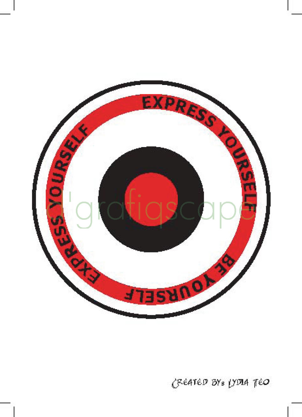
Express Yourself Signs are signs that are introduce to help people in expressing themselves.
Reasons to create these signs are because nowadays, more and more people are getting depressed and unhappy with life, due to stress, and unable, not knowing how or worry of embarrassments to express their emotions. Hence, introducing such signs in hope to help people understand that it is ok to relax and express their own emotions at certain time, certain places.
The background is done to be like a dart board, in order to bring out the aiming idea. I wish people who see the sign will aim and do what is shown. Aim to express yourself, just like throwing dart, aim for the center and go!
Sign #1 – Blast your music
Location: Parks, e.g. Youth Park
Generally, almost everywhere we go, we can see people stuck to their MP3 players. Listening to music/songs is a form of relaxation and expressing too. However, there are times where people get complains, as the music is too loud. In addition, it can be dangerous when people are plugged to their earphones and could not hear any warning from others (e.g. crossing road). By setting some place with the allowance to blast the music, it not only allowing people to have more freedom to express themselves but also a safer way? Let’s get loud!
Sign #2 – Bottoms up
Location: Pubs and Clubs
Be it happy or sad, people drink (as a form of expressing). Let’s bottoms up to celebrate, be it happiness or sadness! But there is a small claus/reminder attached to this sign; Make sure you have trustworthy friend(s)/family members to take care of you if you get drunk. Be yourself but not forgetting to be responsible! Cheers!
Sign #3 – Cry
Location: Counsellor Rooms, Parks
Crying is one of the common ways to relieve stress. However, due to situations and circumstances, like worry about being embarrassed, pride, etc, people tend to suck it in and choose not to cry. This sign is suppose to encourage people to cry, which in a way to convert a message: “There is nothing wrong to cry. Everyone can cry, including guys!” Don’t restraint your own emotions anymore!
Sign #4 – Speak up
Location: Discussion/Meeting/Presentation Room, Speakers’ Corner
Everyone knows it is not easy to really speak up, especially in this country of ours. But now, even Government allows us to talk by having this Speakers’ Corner. So maybe it’s time to speak up? However, my main focus is not really on talking about Government, politics etc, but your very own feelings? It is always better to say it out then have it hidden somewhere bottom of your heart? When you keep too much to yourself, eventually, you might even forget how to communicate with a person! So please for the sake of love, speak up!
Sign #5 – Hugs & Kisses
Location: Airports, Ferry Terminals
How many times you feel embarrass just to give a good friend a hug (especially guys)? But giving hugs and kisses is one way to show you care. Come on, pluck up the courage and show you that you care!
*Hugs and kisses is a term for a sequence of the letters X and O, e.g. XOXO
Thursday, July 1, 2010


Tuesday, June 1, 2010


Saturday, May 1, 2010


Subscribe to:
Posts (Atom)